Bikesdirect.com
About
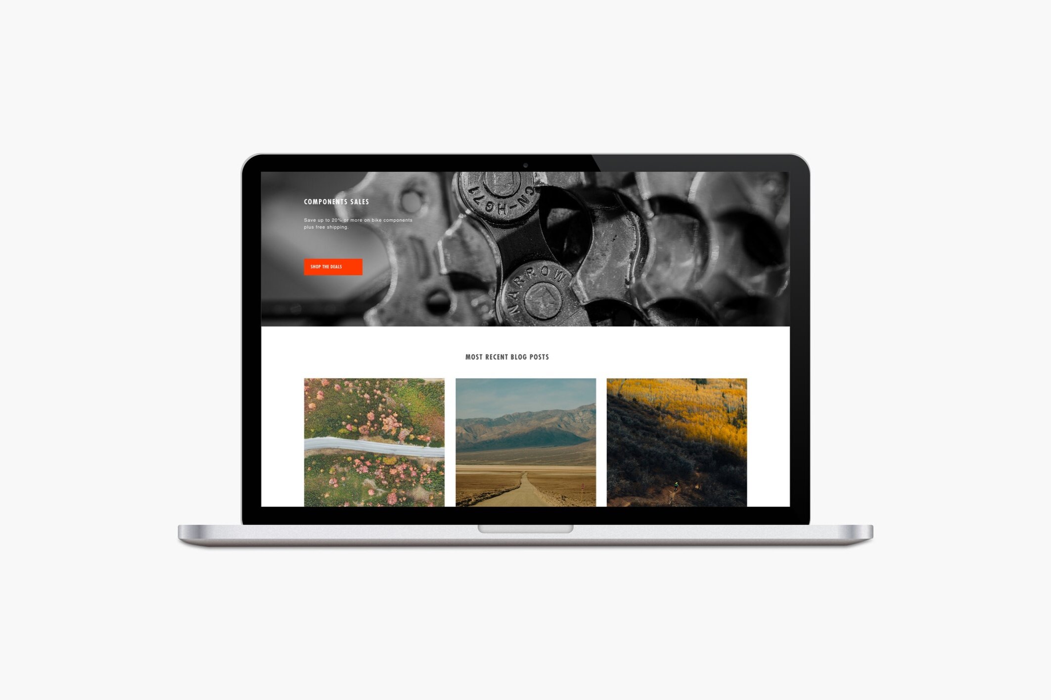
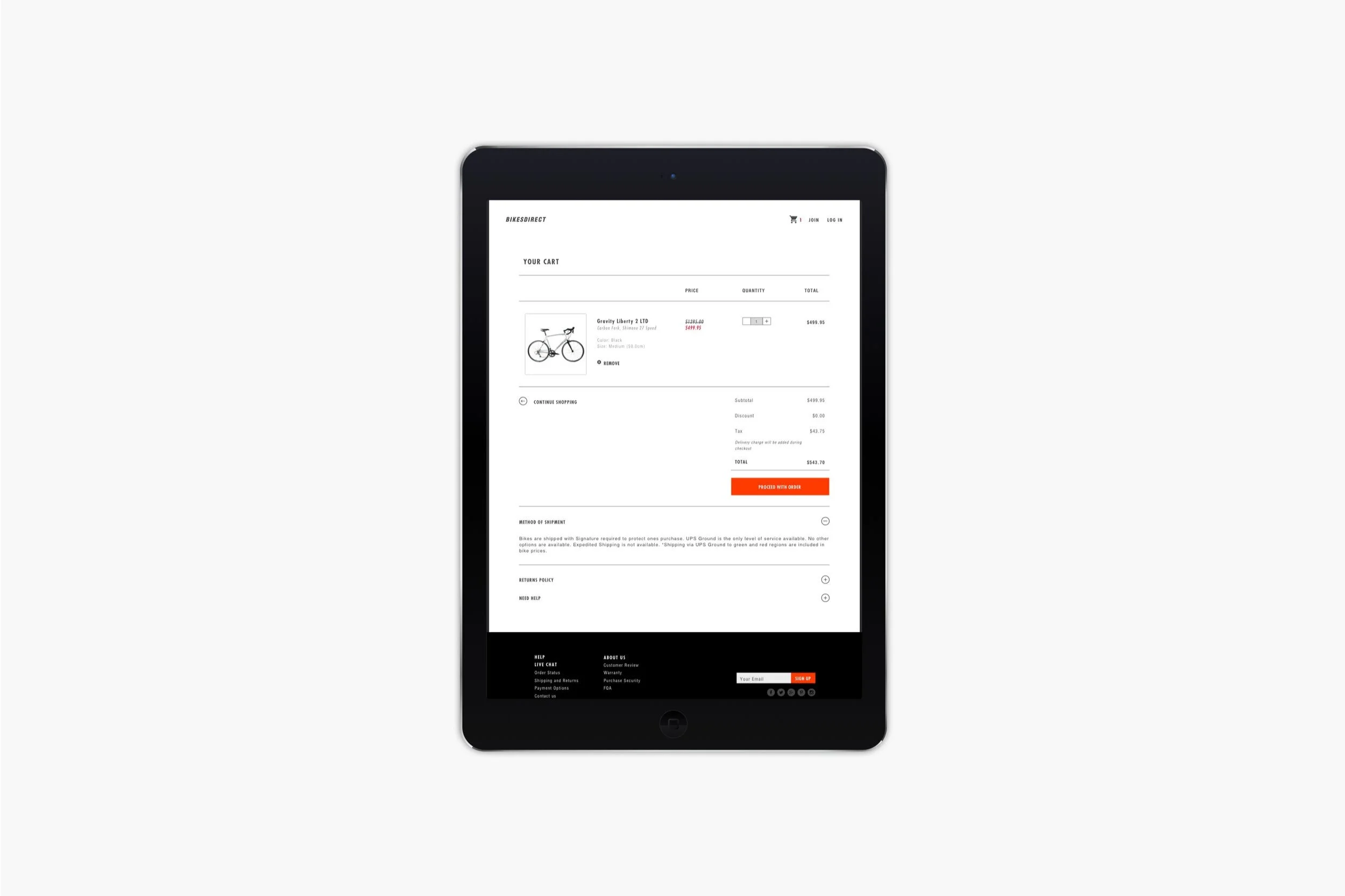
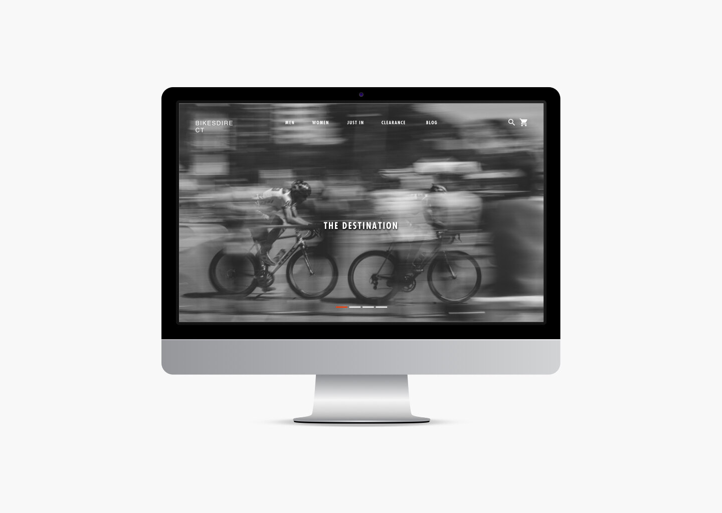
Bikesdirect is an online bike retailer for men and women in the Unite States. The website sells road, mountain, cyclocross, cruiser and hybrid bikes. There are many good brand selections, but the website isn’t very attractive and interesting which lowers the brand identity of the bikes. I would re-design the whole website which includes layout, navigation system, color theme, typography, logo and visual hierarchy. My concept is minimalist yet fresh. I would like to make it easy-to-use, clean, useful, and match the quality of the brand selections.
Tool
Sketch
InVision
Adobe Illustrator
Adobe Photoshop
Approach
Research
Competitive
Prototyping
Problem
The Bikesdirect website has a confusing layout and repetitive navigation system, and there are so many things on the website. The website seems like an advertisement more than an online shopping website. The important details about ordering have a strong yellow background, and the font sizes are too small and too tight in some areas. It hurts our eyes, and it is hard to read.
In each section, there is no CTA button, but we can click on every sentence/word. However, they all lead to the same page. On the product page, there are many drop down bike selections, which I think are coding errors in the original design. The website doesn’t have a search box and filters to search for specific bikes.
Furthermore, each bike has only a single image shot on its page, but under the image, it reads ‘see more detailed pics’. It is a bike gallery in a new browser, but no zooming and no perspective. The shoppers have to go back and forth to compare bike images with bike details. The layout on the shopping page doesn't have bike images. If the shoppers want to see, they have to click on every bike title. It takes a long time to shop. Moreover, the specifications of the bikes are in lists. It would be better in tables.
On the check out page, there is an error which shows the cart is empty, even though the shoppers have added the bike to cart. It could be sold out, but the website doesn’t say anything. In addition, there is no live chat or chatroom to ask about the merchandise; only a few FAQs that might not cover answers for the shoppers.
Original Website
Competitive Analysis
Specialized
An online website that sells different kinds of bicycles for men, women and kids. The company was founded in 1974 with the inspiration from people who wanted to ride cruisers in the dirt and roadies who wanted to go faster. Later on, when they saw kids struggling to focus in school, they started the Specialized Foundation to help them through cycling.
Trek Bikes
An online website that sells bicycles, bike equipment, gears and apparels. Trek Bikes began in 1976, to make the best bicycles the world has ever seen. The product will be made of the highest quality craftsmanship and bring the joy of cycling to a broader audience. Today, they have made it their mission to aid in the betterment of the planet through cycling.
Competitive Cyclist
An online specialty retailer of road and mountain bikes, components, apparel and accessories. They have personalized service from the best local shops that features a dynamic, interactive experience only possible on the Web — specially designed to make you knowledgeable and confident about every product they sell.
Market Analysis
Target Audience
The new design is targeting males in San Francisco,
California from the ages of 22 to 26, with the income ranging from 45k to 80k per year. They are single, and they are middle class. They are well-educated as well as working in creative fields. They are interested in outdoor activities; especially in cycling.
The target audience is a part of the digital media world, who have high empathy for technology. They can be using a laptop, desktop or phone for the shopping experience.
As they are working in creative fields; they like to shop on the nice, clean, easy-to-use and reliable websites. They need details of bikes’ specifications and materials, better quality of bike images, and good service during or after purchasing the bike.
Persona
Name: Jeff, 26 years old
Gender: Male
Occupation: Graduate Student
Location: San Francisco, CA
Marital Status: Single
Interests: Outdoor activities
Tech Empathy: High
Uses: iPhone, Macbook
“I want to buy an affordable bikes for new experiences. So I need quick, easy-to-use and proprietary website with nice visual hierarchy.”
Frustrations:
• Each bike has only a single image on its page, but under the image, it reads ‘see more detailed pics’. It is a bike gallery in a new browser but no zoom in and out and no perspectives. He has to go back and forth to compare bike images and bike details.
• He has a problem with the check out page. He chose the bike but in the cart says it is empty. It could be sold out but the website don’t say anything.
• The important details about the ordering have a strong yellow background. It hurts his eyes.
• The layout of the shopping page didn’t have images for each bike. He can’t see the visuals of them. If he wants to see, he has to click on every bike. It takes a long time to shop.
Needs:
• Affordable bikes for new experiences.
• Quick and easy to use website with nice visual hierarchy.
• Convenient and proprietary website.
Persona
Name: Morgan, 24 years old
Gender: Female
Occupation: Graphic Designer
Location: San Francisco, CA
Marital Status: Single
Interests: Art/Design and Cycling
Tech Empathy: High
Uses: iPhone, Macbook, iPad
Morgan is a 24-year old graphic designer, who is currently working in a start-up company in the Mission District. This is her first job, and she can’t afford a car. She always commutes from her house to work by bike. She likes to hangout in the Mission, Dolores Park, and Valencia Street areas with her bike. Morgan always looks for her interests on the Internet. She likes to shop for stuff through nice visual websites because she is a graphic designer. Recently, she wants to buy a new bike to use for sport because the one she has is a commuter bike.
Needs:
• A new bike for exercising.
• A visually beautiful and clean layout and an easy-to-use website.
• Clear bike specifications in order to find the right size.
Frustrations:
• The Bikesdirect website has a confusing layout and repetitive navigation systems. It creates confusion when she looks for a new bike.
• There is no CTA button and when she hovers on bold words or sentences, she finds out she can click them, but they all lead to the same page.
• There are many drop down selections for the bike which she thinks are coding errors in the original design.
• Font sizes and colors don’t make any sense with the title and information.
• She wants to search and apply filters to minimize the search for the right bike that she is looking for, but she can’t find them from this website.
Branding
Sketch
User Case/Flow
Low-Fidelity
Final Design


